
こんにちは、JS2IIUです。
Matplotlibでグラフを作成する際、データの値を色で表現したい場合があります。そんな時に役立つのが colormap です。colormapは、数値と色を対応づけるもので、データの分布や変化を視覚的に表現するのに非常に役立ちます。
例えば、気温の分布を地図上に表示する場合、低い気温を青色、高い気温を赤色で表示することで、直感的に気温の分布を理解することができます。
colormapの種類
Matplotlibには、様々なcolormapが用意されています。大きく分けて、以下の種類があります。
- Sequential: 連続的な値の変化を表現するのに適しています。
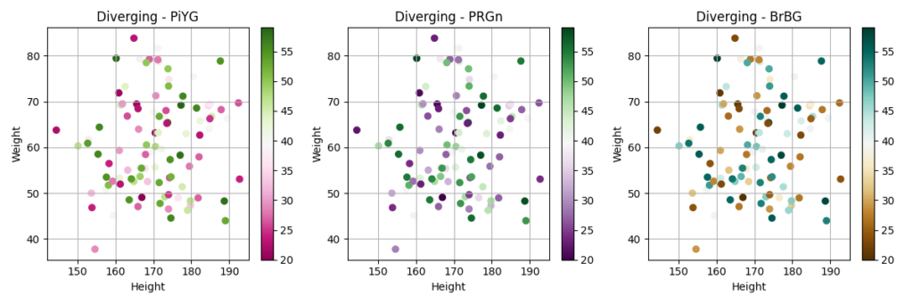
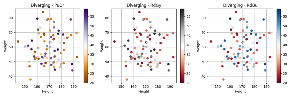
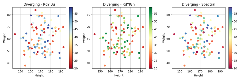
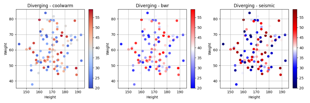
- Diverging: 中心値を基準に、正負の値を異なる色で表現するのに適しています。
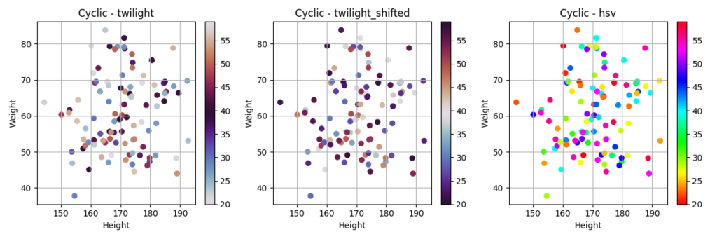
- Cyclic: 周期的な値の変化を表現するのに適しています。
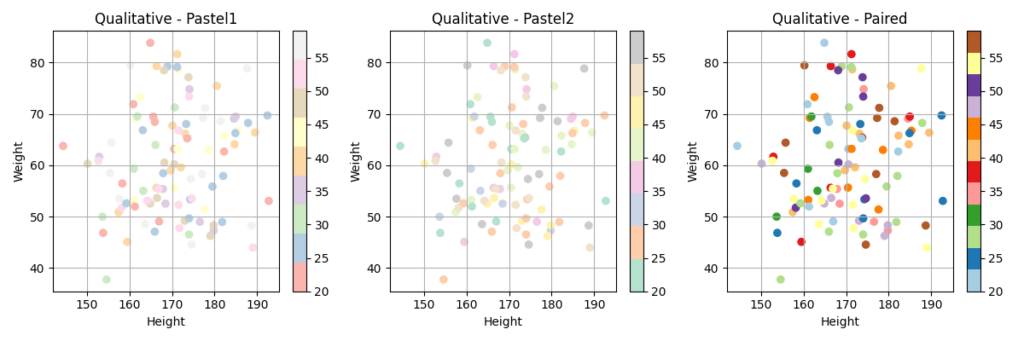
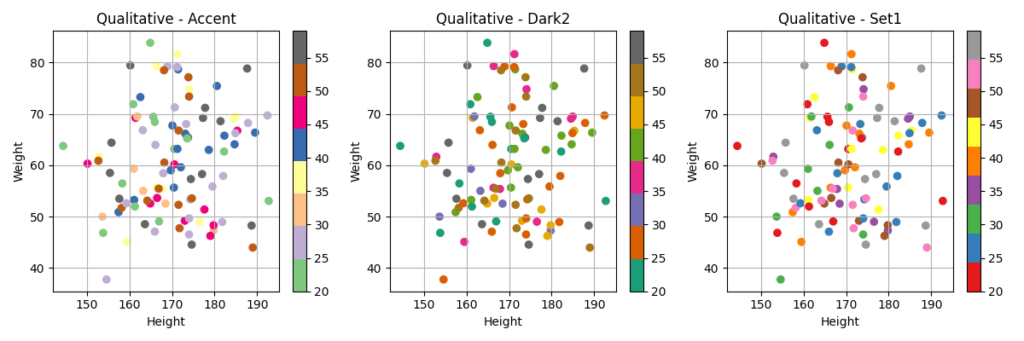
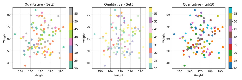
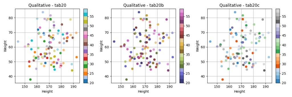
- Qualitative: 質的なデータの分類を表現するのに適しています。
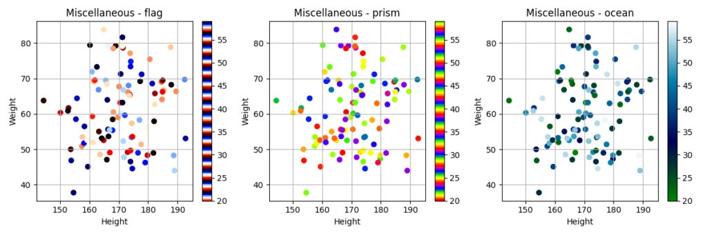
- Miscellaneous: その他のcolormapです。
colormapの選択
colormapは、データの性質や可視化の目的に合わせて適切なものを選択する必要があります。
例えば、連続的な値の変化を表現する場合には、Sequentialなcolormapが適しています。また、正負の値を異なる色で表現する場合には、Divergingなcolormapが適しています。
colormapの選択に迷った場合は、以下のサイトを参考にしてみてください。
- Colormap reference — Matplotlib 3.9.3 documentation
- Choosing Colormaps in Matplotlib — Matplotlib 3.9.3 documentation
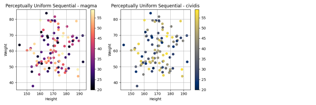
Perceptually Uniform Sequential
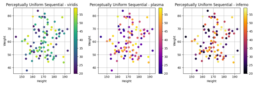
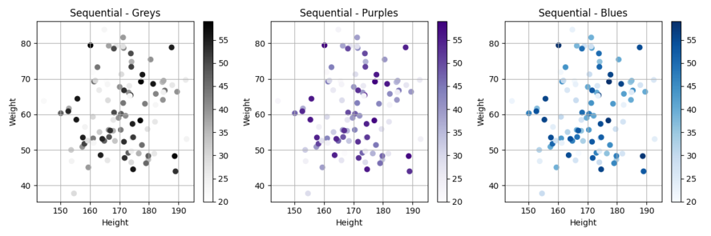
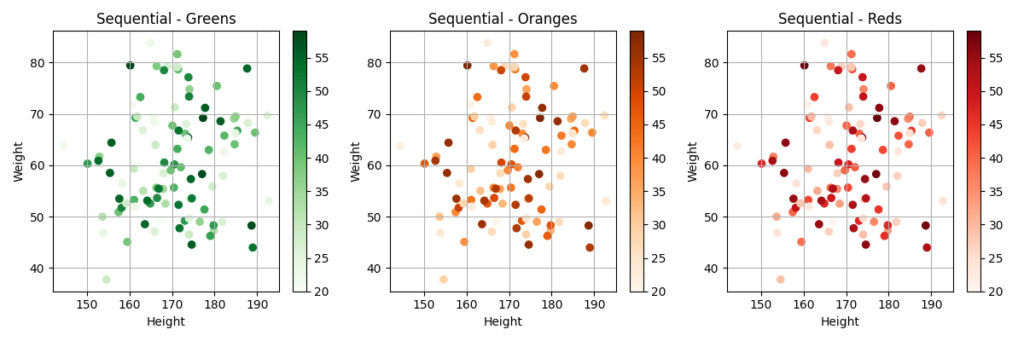
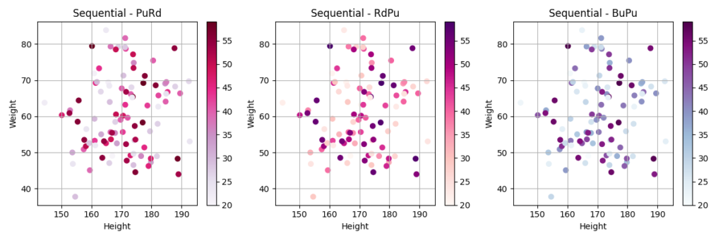
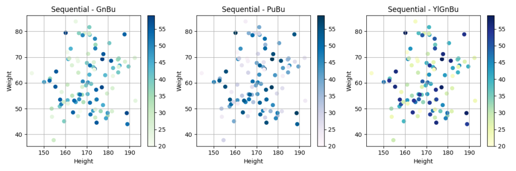
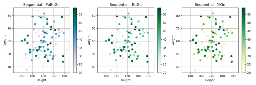
Sequential

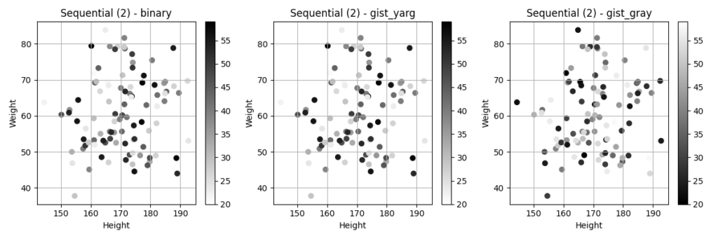
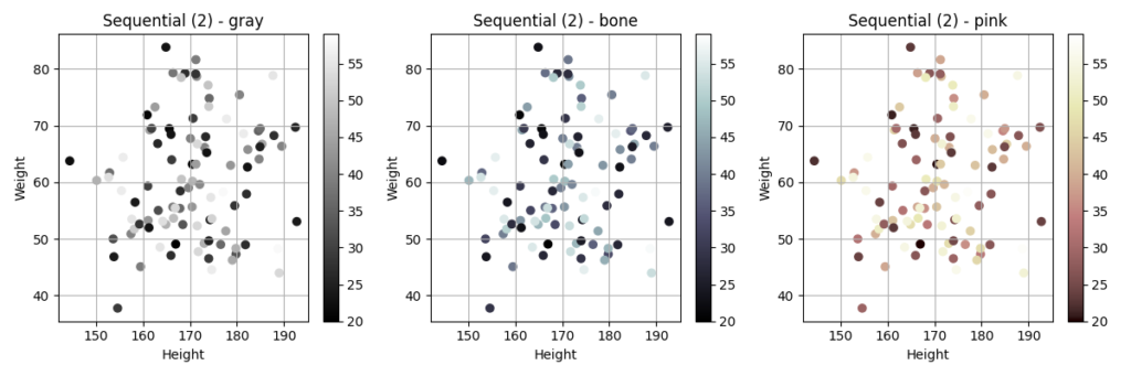
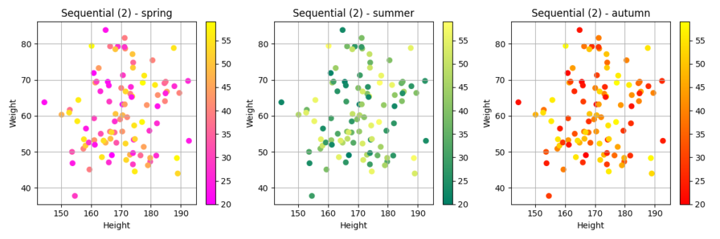
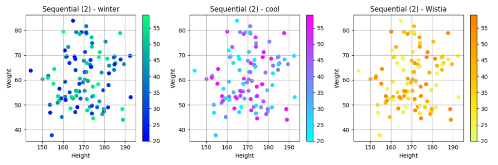
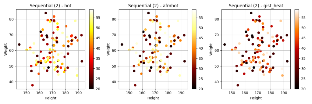
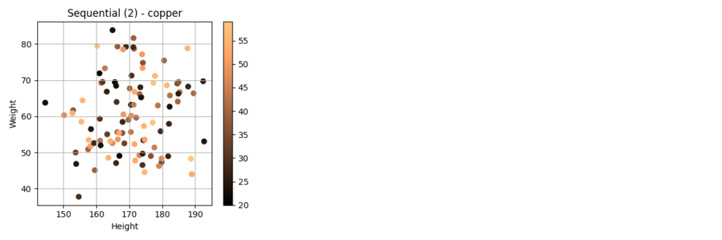
Sequential (2)
Diverging
Cyclic
Qualitative
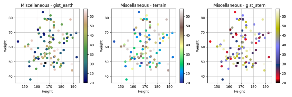
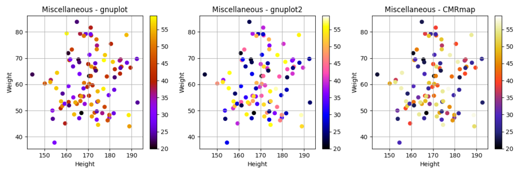
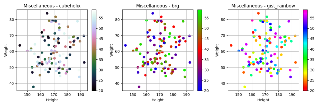
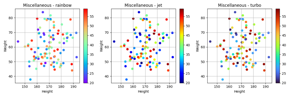
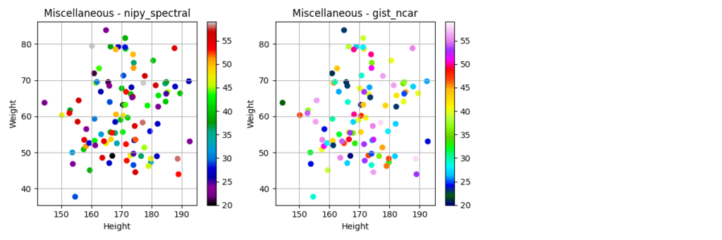
Miscellaneous
colormapを使ってみよう
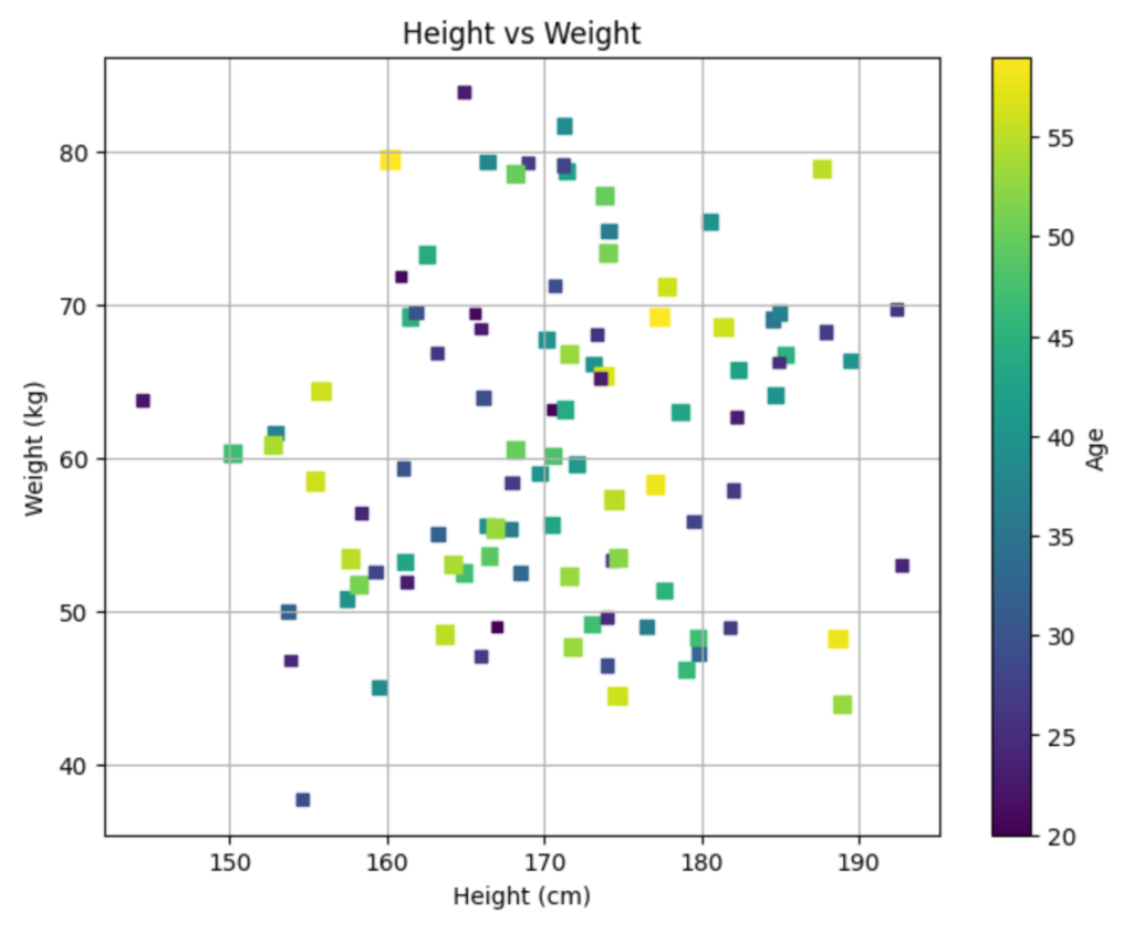
それでは、実際にcolormapを使ってグラフを作成してみましょう。今回は、身長、体重、年齢のデータを使って、年齢を色で表現した散布図を作成します。
サンプルプログラム
import matplotlib.pyplot as plt
import numpy as np
import pandas as pd

# サンプルデータの作成
np.random.seed(0)
data = {
    'Height': np.random.normal(170, 10, 100),
    'Weight': np.random.normal(60, 10, 100),
    'Age': np.random.randint(20, 60, 100)
}
df = pd.DataFrame(data)

# colormap list
cmaps = [
    ('Perceptually Uniform Sequential',
     ['viridis', 'plasma', 'inferno', 'magma', 'cividis']),
    ('Sequential',
     ['Greys', 'Purples', 'Blues', 'Greens', 'Oranges', 'Reds',
      'YlOrBr', 'YlOrRd', 'OrRd', 'PuRd', 'RdPu', 'BuPu',
      'GnBu', 'PuBu', 'YlGnBu', 'PuBuGn', 'BuGn', 'YlGn']),
    ('Sequential (2)',
     ['binary', 'gist_yarg', 'gist_gray', 'gray', 'bone', 'pink',
      'spring', 'summer', 'autumn', 'winter', 'cool', 'Wistia',
      'hot', 'afmhot', 'gist_heat', 'copper']),
    ('Diverging',
     ['PiYG', 'PRGn', 'BrBG', 'PuOr', 'RdGy', 'RdBu',
      'RdYlBu', 'RdYlGn', 'Spectral', 'coolwarm', 'bwr', 'seismic']),
    ('Cyclic', ['twilight', 'twilight_shifted', 'hsv']),
    ('Qualitative',
     ['Pastel1', 'Pastel2', 'Paired', 'Accent',
      'Dark2', 'Set1', 'Set2', 'Set3',
      'tab10', 'tab20', 'tab20b', 'tab20c']),
    ('Miscellaneous',
     ['flag', 'prism', 'ocean', 'gist_earth', 'terrain', 'gist_stern',
      'gnuplot', 'gnuplot2', 'CMRmap', 'cubehelix', 'brg',
      'gist_rainbow', 'rainbow', 'jet', 'turbo', 'nipy_spectral',
      'gist_ncar'])
]

for i in range(len(cmaps)):
    n_row = len(cmaps[i][1]) // 3
    if len(cmaps[i][1]) % 3 != 0:
        n_row += 1
    n_col = 3

    # グラフの大きさを調整
    fig, axes = plt.subplots(n_row, n_col, figsize=(n_col * 4, n_row * 4))

    # If axes is 1-dimensional, convert it to 2-dimensional
    if n_row == 1:
        axes = axes.reshape(1, -1)  # Reshape to (1, n_col)

    for j in range(len(cmaps[i][1])):
        cmap = cmaps[i][1][j]
        ax = axes[j // n_col, j % n_col]
        scatter = ax.scatter(df['Height'], df['Weight'], c=df['Age'], cmap=cmap)
        ax.set_title(f'{cmaps[i][0]} - {cmap}')
        ax.set_xlabel('Height')
        ax.set_ylabel('Weight')
        ax.grid(True)

        # カラーバーを追加
        fig.colorbar(scatter, ax=ax)

    plt.tight_layout()
    plt.savefig(f'{cmaps[i][0]}.png')
プログラムの解説
np.random.seed(0): 乱数のシードを固定することで、毎回同じ結果が得られるようにしています。data = ...: 身長、体重、年齢のデータを辞書型で作成しています。df = pd.DataFrame(data): 辞書型のデータをpandasのDataFrameに変換しています。cmaps = ...: 使用するcolormapのリストを作成しています。for i in range(len(cmaps)): colormapのリストをループで処理しています。n_row = ...,n_col = ...: グラフの行数と列数を計算しています。fig, axes = plt.subplots(...): グラフのfigureとaxesを作成しています。if n_row == 1:: axesが1次元配列の場合、2次元配列に変換しています。for j in range(len(cmaps[i][1])): 各colormapをループで処理しています。cmap = ...: 現在のcolormapを取得しています。ax = ...: 現在のaxesを取得しています。scatter = ax.scatter(...): 散布図を作成しています。ax.set_title(...): グラフのタイトルを設定しています。ax.set_xlabel(...),ax.set_ylabel(...): 軸ラベルを設定しています。ax.grid(True): グリッドを表示しています。fig.colorbar(scatter, ax=ax): カラーバーを追加しています。plt.tight_layout(): グラフのレイアウトを調整しています。plt.savefig(...): グラフを画像ファイルとして保存しています。
RuntimeWarningが出る場合
上記のサンプルプログラムを実行すると、次のようなメッセージが表示される場合があります。
RuntimeWarning: More than 20 figures have been opened. Figures created through the pyplot interface (`matplotlib.pyplot.figure`) are retained until explicitly closed and may consume too much memory. (To control this warning, see the rcParam `figure.max_open_warning`). Consider using `matplotlib.pyplot.close()`.この警告は、Matplotlibで多くのfigureを作成し、明示的に閉じずにそのままにしているために発生しています。Matplotlibは、plt.figure() で作成されたfigureをメモリに保持し続けるため、多くのfigureを開いたままにするとメモリを大量に消費する可能性があります。
今回のプログラムでは、colormapの種類ごとに複数の画像ファイルを出力しています。その際に、 plt.figure() で作成されたfigureがループ内で繰り返し作成され、明示的に閉じられていないため、警告が発生していると考えられます。
修正案としては、 plt.close() を使用して、figureを明示的に閉じるようにします。具体的には、 plt.savefig() の後に plt.close() を追加します。
修正後のサンプルプログラムは以下のとおりです。
import matplotlib.pyplot as plt
import numpy as np
import pandas as pd

# サンプルデータの作成
np.random.seed(0)
data = {
    'Height': np.random.normal(170, 10, 100),
    'Weight': np.random.normal(60, 10, 100),
    'Age': np.random.randint(20, 60, 100)
}
df = pd.DataFrame(data)

# colormap list
cmaps = [
    ('Perceptually Uniform Sequential',
     ['viridis', 'plasma', 'inferno', 'magma', 'cividis']),
    ('Sequential',
     ['Greys', 'Purples', 'Blues', 'Greens', 'Oranges', 'Reds',
      'YlOrBr', 'YlOrRd', 'OrRd', 'PuRd', 'RdPu', 'BuPu',
      'GnBu', 'PuBu', 'YlGnBu', 'PuBuGn', 'BuGn', 'YlGn']),
    ('Sequential (2)',
     ['binary', 'gist_yarg', 'gist_gray', 'gray', 'bone', 'pink',
      'spring', 'summer', 'autumn', 'winter', 'cool', 'Wistia',
      'hot', 'afmhot', 'gist_heat', 'copper']),
    ('Diverging',
     ['PiYG', 'PRGn', 'BrBG', 'PuOr', 'RdGy', 'RdBu',
      'RdYlBu', 'RdYlGn', 'Spectral', 'coolwarm', 'bwr', 'seismic']),
    ('Cyclic', ['twilight', 'twilight_shifted', 'hsv']),
    ('Qualitative',
     ['Pastel1', 'Pastel2', 'Paired', 'Accent',
      'Dark2', 'Set1', 'Set2', 'Set3',
      'tab10', 'tab20', 'tab20b', 'tab20c']),
    ('Miscellaneous',
     ['flag', 'prism', 'ocean', 'gist_earth', 'terrain', 'gist_stern',
      'gnuplot', 'gnuplot2', 'CMRmap', 'cubehelix', 'brg',
      'gist_rainbow', 'rainbow', 'jet', 'turbo', 'nipy_spectral',
      'gist_ncar'])
]

for i in range(len(cmaps)):
    n_row = len(cmaps[i][1]) // 3
    if len(cmaps[i][1]) % 3 != 0:
        n_row += 1
    n_col = 3

    # グラフの大きさを調整
    fig, axes = plt.subplots(n_row, n_col, figsize=(n_col * 4, n_row * 4))

    # If axes is 1-dimensional, convert it to 2-dimensional
    if n_row == 1:
        axes = axes.reshape(1, -1)  # Reshape to (1, n_col)

    for j in range(len(cmaps[i][1])):
        cmap = cmaps[i][1][j]
        ax = axes[j // n_col, j % n_col]
        scatter = ax.scatter(df['Height'], df['Weight'], c=df['Age'], cmap=cmap)
        ax.set_title(f'{cmaps[i][0]} - {cmap}')
        ax.set_xlabel('Height')
        ax.set_ylabel('Weight')
        ax.grid(True)

        # カラーバーを追加
        fig.colorbar(scatter, ax=ax)

    plt.tight_layout()
    plt.savefig(f'{cmaps[i][0]}.png')

    # figureを明示的に閉じる
    plt.close()
まとめ
colormapは、データを色で表現することで、データの分布や変化を視覚的に表現するのに役立ちます。Matplotlibには、様々なcolormapが用意されているので、データの性質や可視化の目的に合わせて適切なものを選択しましょう。
最後まで読んでいただきありがとうございました。


コメント