


こんにちは、JS2IIUです。
機械学習のモデル評価によく使われる混同行列、ROC曲線、AUCを計算して表示するアプリをStreamlit上に実装していきます。今回もよろしくお願いします。
【はじめに】
機械学習でモデルを作成したら、その機能をどのように評価するかが重要なポイントです。この記事では、分類モデルの評価によく使われる指標である以下、
- 混同行列 (Confusion Matrix)
- ROC曲線 (Receiver Operating Characteristic Curve)
- AUC (Area Under the Curve)
などを Streamlit を使ってわかりやすく表示する方法を解説します。

混同行列、ROC曲線、AUC
🔷 混同行列(Confusion Matrix)

● 概要
混同行列は、分類モデルの予測結果と実際の正解ラベルの対応関係を表形式でまとめたものです。特に 2値分類(二クラス分類) でよく使われます。
● 基本の構造(2値分類の場合)
| 実際 Positive | 実際 Negative | |
|---|---|---|
| 予測 Positive | True Positive (TP) | False Positive (FP) |
| 予測 Negative | False Negative (FN) | True Negative (TN) |
- TP(真陽性): 実際にPositiveで、予測もPositive
- FP(偽陽性): 実際はNegativeなのに、予測はPositive
- FN(偽陰性): 実際はPositiveなのに、予測はNegative
- TN(真陰性): 実際にNegativeで、予測もNegative
● 混同行列から算出される指標
- Accuracy(正解率)
$$(TP + TN) / (TP + FP + FN + TN))$$
→ モデル全体の正解率。 - Precision(適合率)
$$TP / (TP + FP)$$
→ Positiveと予測された中で、正しかった割合。 - Recall(再現率)
$$TP / (TP + FN)$$
→ 実際にPositiveなものを、どれだけ正しく予測できたか。 - F1-score
$$2 × (Precision × Recall) / (Precision + Recall)$$
→ PrecisionとRecallのバランスを取った指標。
🔷 ROC曲線(Receiver Operating Characteristic Curve)

● 概要
ROC曲線は、分類モデルの 判定閾値(しきい値) を変化させながら、次の2つの指標を軸にとった曲線です:
- x軸:False Positive Rate(FPR)
$$FPR = FP / (FP + TN)$$
→ 偽陽性の割合 - y軸:True Positive Rate(TPR) = Recall
$$TPR = TP / (TP + FN)$$
→ 真陽性の割合(再現率)
● ROC曲線の特徴
- モデルがしきい値を変えると、TPRとFPRが変化します。その点をプロットしていくと曲線が描かれます。
- 理想的なモデルは、左上隅(TPR=1, FPR=0)に近づくような曲線になります。
- ランダムな分類器のROC曲線は、対角線(y = x) になります。
🔷 AUC(Area Under the Curve)
● 概要
AUCは、ROC曲線の 下の面積 を数値で表したものです。
- 値の範囲は 0~1
- AUCが高いほど、モデルは分類の性能が良いとされます。
● AUCの意味
- AUC = 1.0
→ 完璧な分類(すべての正例が負例より高いスコアを持つ) - AUC = 0.5
→ 無作為な分類と同等(性能なし) - AUC = 0.0〜0.5
→ 逆に分類している(予測が全て間違っている可能性)
✅ まとめ表
| 指標 | 意味 |
|---|---|
| 混同行列 | 予測結果と正解ラベルの対応を表形式で示す |
| ROC曲線 | FPRとTPRの関係を示す曲線 |
| AUC | ROC曲線の下の面積。分類性能の良さの指標 |
【STEP1】使用するライブラリをインストール
最初に以下のライブラリをインストールします:
Bash
pip install streamlit scikit-learn matplotlib seaborn【STEP2】データとモデルを準備
scikit-learn のみをデータを使い、ロジスティック回復を使った分類モデルを作成します:
Python
# model_evaluation_app.py
import streamlit as st
from sklearn.datasets import load_breast_cancer
from sklearn.model_selection import train_test_split
from sklearn.linear_model import LogisticRegression
from sklearn.metrics import confusion_matrix, roc_curve, auc, classification_report
import matplotlib.pyplot as plt
# matplotlibの日本語フォント設定
import japanize_matplotlib
import seaborn as sns
import pandas as pd
import numpy as np

# タイトル
st.title("🔍 分類モデルの評価指標を表示するアプリ")

# データの読み込み
data = load_breast_cancer()
X = pd.DataFrame(data.data, columns=data.feature_names)
y = pd.Series(data.target)

# データ分割
X_train, X_test, y_train, y_test = train_test_split(X, y, test_size=0.2, random_state=42)

# モデルの訓練
model = LogisticRegression(max_iter=10000)
model.fit(X_train, y_train)

# 予測
y_pred = model.predict(X_test)
y_prob = model.predict_proba(X_test)[:, 1]
🔹 データの読み込みと前処理
Python
data = load_breast_cancer()
X = pd.DataFrame(data.data, columns=data.feature_names)
y = pd.Series(data.target)- 乳がんデータセットを読み込み、特徴量(X)と目的変数(y)に分けます。
Xは診断に関わる数値的な特徴(例:腫瘍の大きさなど)。yは分類ラベル(0=悪性, 1=良性)。
🔹 データの分割
Python
X_train, X_test, y_train, y_test = train_test_split(X, y, test_size=0.2, random_state=42)- データを学習用(80%)とテスト用(20%)にランダム分割します。
random_state=42により再現性が保証されます。
🔹 モデルの学習(訓練)
Python
model = LogisticRegression(max_iter=10000)
model.fit(X_train, y_train)- ロジスティック回帰モデルを作成し、学習用データで訓練します。
max_iter=10000は学習時の最大繰り返し回数。データが多い場合に必要。
🔹 モデルによる予測
Python
y_pred = model.predict(X_test)
y_prob = model.predict_proba(X_test)[:, 1]y_pred: テストデータに対してクラス(0 または 1)を予測。y_prob: クラス「1」である確率を予測。ROC曲線やAUCの計算に使います。
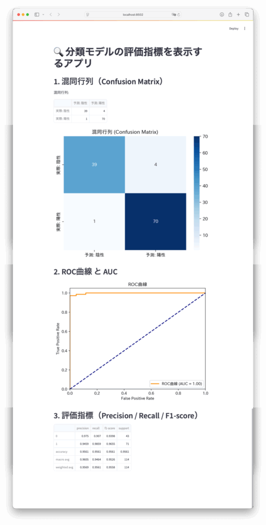
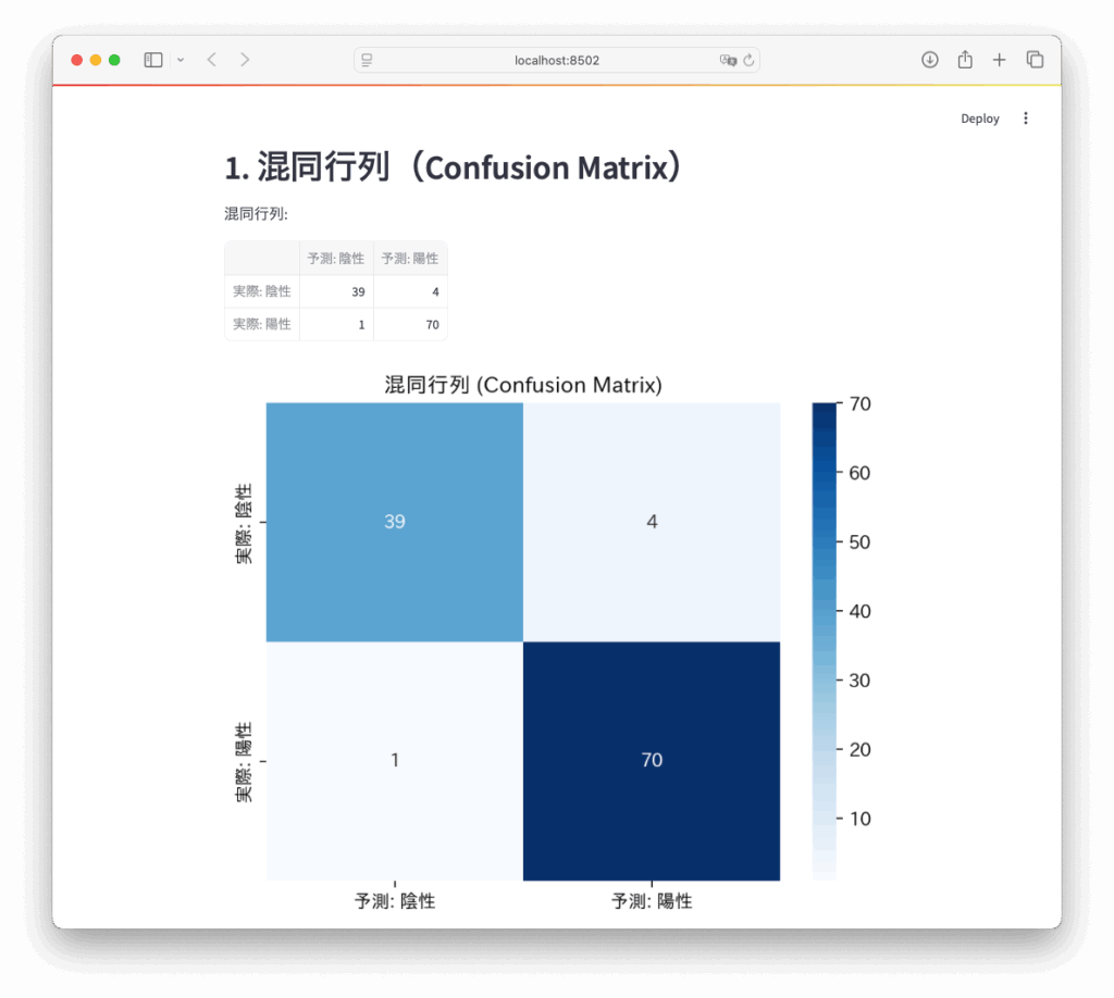
【STEP3】混同行列を表示
Python
st.header("1. 混同行列(Confusion Matrix)")
cm = confusion_matrix(y_test, y_pred)
st.write("混同行列:")
st.dataframe(pd.DataFrame(cm, index=["実際: 陰性", "実際: 陽性"], columns=["予測: 陰性", "予測: 陽性"]))

# 混同行列のグラフ
fig_cm, ax_cm = plt.subplots()
sns.heatmap(cm, annot=True, fmt='d', cmap='Blues', ax=ax_cm,
            xticklabels=["予測: 陰性", "予測: 陽性"],
            yticklabels=["実際: 陰性", "実際: 陽性"])
ax_cm.set_title("混同行列 (Confusion Matrix)")
st.pyplot(fig_cm)annot=Trueで数値を表示fmt='d'で整数として表示
【STEP4】ROC曲線とAUCを表示
Python
# ROC曲線の描画
fpr, tpr, thresholds = roc_curve(y_test, y_prob)
roc_auc = auc(fpr, tpr)

fig_roc, ax_roc = plt.subplots()
ax_roc.plot(fpr, tpr, color='darkorange', lw=2, label=f'ROC曲線 (AUC = {roc_auc:.2f})')
ax_roc.plot([0, 1], [0, 1], color='navy', lw=2, linestyle='--')
ax_roc.set_xlim([0.0, 1.0])
ax_roc.set_ylim([0.0, 1.05])
ax_roc.set_xlabel('False Positive Rate')
ax_roc.set_ylabel('True Positive Rate')
ax_roc.set_title('ROC曲線')
ax_roc.legend(loc="lower right")
st.pyplot(fig_roc)
🔹1. ROC曲線とAUCスコアの計算
Python
fpr, tpr, thresholds = roc_curve(y_test, y_prob)roc_curve()は、偽陽性率(FPR) と 真陽性率(TPR) をさまざまな閾値(threshold)で計算します。fpr:False Positive Rate(偽陽性率)tpr:True Positive Rate(真陽性率、=再現率)thresholds:各点に対応する分類のしきい値(0~1)y_testは正解ラベル、y_probは「クラス1である確率」です。
Python
roc_auc = auc(fpr, tpr)auc()は ROC曲線の下の面積(AUCスコア)を計算します。- AUC(Area Under the Curve)は0.5〜1の間の値で、1に近いほど高性能。
- AUC=0.5:ランダムな予測、AUC=1:完全な分類。
🔹2. グラフの作成とプロット
Python
fig_roc, ax_roc = plt.subplots()fig_rocは図全体、ax_rocは描画領域(Axes)です。
Python
ax_roc.plot(fpr, tpr, color='darkorange', lw=2, label=f'ROC曲線 (AUC = {roc_auc:.2f})')- 偽陽性率(x軸)と真陽性率(y軸)を線グラフで描画。
labelで凡例に AUC 値を表示。
Python
ax_roc.plot([0, 1], [0, 1], color='navy', lw=2, linestyle='--')- これは完全ランダムな分類器を示す対角線。ROC曲線がこの線より上にあるほど性能が良い。
🔹3. グラフの装飾
Python
ax_roc.set_xlim([0.0, 1.0])
ax_roc.set_ylim([0.0, 1.05])- x軸とy軸の表示範囲を設定。
Python
ax_roc.set_xlabel('False Positive Rate')
ax_roc.set_ylabel('True Positive Rate')
ax_roc.set_title('ROC曲線')- 軸ラベルとグラフタイトルの設定。
Python
ax_roc.legend(loc="lower right")- 凡例を右下に表示。
🔹4. Streamlitで表示
Python
st.pyplot(fig_roc)- 作成したグラフ
fig_rocを Streamlit アプリ上に描画・表示します。
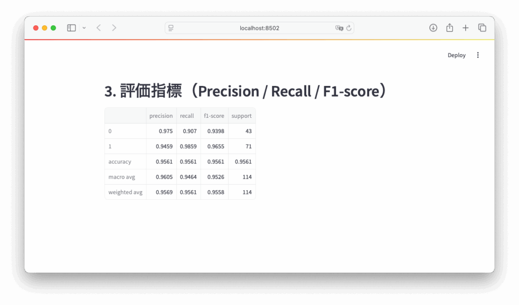
【STEP5】その他の評価指標を表示
Python
st.header("3. 評価指標(Precision / Recall / F1-score)")
report = classification_report(y_test, y_pred, output_dict=True)
st.dataframe(pd.DataFrame(report).transpose())
🔸モデルの評価レポートを作成
Python
report = classification_report(y_test, y_pred, output_dict=True)classification_report()は、Scikit-learn が提供する関数で、分類結果の精度評価を数値で返します。y_test: 実際のラベル(正解)y_pred: モデルによって予測されたラベル
この関数が計算する主な指標:
| 指標 | 説明 |
|---|---|
| Precision(適合率) | モデルが「正」と予測したうち、実際に正しかった割合 |
| Recall(再現率) | 実際に「正」であるものを、どれだけ正しく予測できたか |
| F1-score(F1値) | Precision と Recall の調和平均(バランスの指標) |
| support(サポート) | 各クラスに属するサンプルの数 |
output_dict=Trueにすることで、出力をテキストではなく 辞書形式(dict)にします。これは後で表に変換するために便利です。
🔸評価指標を表として表示
Python
st.dataframe(pd.DataFrame(report).transpose())pd.DataFrame(report):辞書形式のレポートを DataFrame に変換。.transpose():行列を入れ替え(行=クラス名、列=Precisionなど)て見やすく整形。st.dataframe(...):Streamlit 上でスクロール可能な表として表示。

【参考リンク】
- scikit-learn: classification_report
- Streamlit Documentation
- ROC and AUC explained visually (towardsdatascience)
最後に書籍のPRです。
24年11月に第3版が発行された「scikit-learn、Keras、TensorFlowによる実践機械学習 第3版」、Aurélien Géron 著。下田、牧、長尾訳。機械学習のトピックスについて手を動かしながら網羅的に学べる書籍です。ぜひ手に取ってみてください。

最後まで読んでいただきありがとうございます。